Hello all! The March Fodder School classes have been full of joy and moments of reflection. The invitation from this month's teacher, Shay Kent, was to tell our life story on a decorative board, and so began a process of gathering, making, sifting and composition. I found my way to an assemblage of visual poetry which makes me deeply happy.
This post is a long one, exploring some of the story of my creative life journey in words and pictures and objects, so you might want a cup of coffee or a glass of wine at hand.
(I obviously won't be sharing any of Shay's techniques or instructions here - you'll need to join Fodder School for all those details! - but I am going to include a bit about how I constructed my "board", since it's nothing like hers.)
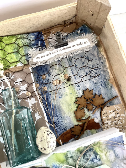
You'll notice very quickly that a) it's not a board, but a box (or a crate, really); and b) it's not my whole life story. It's an array of elements that hold meaning in my creative life journey, shaping who I am and how I live my life, full of stories about the things that matter to me, both in words and pictures.
Not so much my life in a box, as a life lived outside of many boxes...
Instagram doesn't really allow for long form descriptive writing, so I've decided to share some of the stories and meanings which are threaded through the elements in this wooden crate here on the blog, where War and Peace-length posts have always been traditional.First, some practicalities... starting with the choice of the wooden crate - picked up for free in a supermarket fruit and vegetable section. If you've followed me for a while, you'll know that much of my craft studio storage makes use of wooden crates (all picked up for free).For years, they have transported both books and art supplies to and fro when I've been on the move for work. (A long ago What's On Your Workdesk Wednesday post even shows how, having been used to pack and transport the supplies, the crates then became the shelves on which I kept things while working away from home.)
And now they help store stamps (and lots of other supplies) on the shelves in my studio, having had a coat of white paint to zhuzh them up, along with some kraft/wildflower wrapping paper coverings. They work beautifully as storage both upright and on their sides...Some (small) crates are used to display the many (many) tags I make, ready for flipping through for inspiration...
And some cope with much messier storage of fodder, or part-made or waiting-to-be-made projects.
So when I was initially collecting possible things for inclusion, it was automatic to me to gather them in one of the shallow crates I grab whenever I see one in the supermarket which is nearly empty of spring onions (or raspberries or whatever it happens to be).
It wasn't long before I realised that actually I'd far rather have a wooden crate up on the wall than a pinboard. It fits much better with the rest of the studio aesthetic, and it makes it easier to display lots of the heavier, dimensional objects which it was important to me to include.
But I also needed a surface I could pin things into, so I grabbed a couple of the (many) cheap canvases I have hanging around the craft room, and tried to work out a way to fit those in the crate. (I've kept that label - "Czech Farm" - on the side... my move to the Czech Republic is definitely part of this creative story.)To secure them, I used a bradawl to make holes where they were needed...
... and then screwed right through the crate into the wooden frames of the canvases.
Not only does the layered arrangement give me the dimension and architecture I love to have in my artwork...
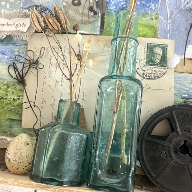
... but it creates a perfect "shelf" on which to stand the glass bottles (of which more later - they are significant!).
I knew my life wasn't going to fit in one box, so I wired some hooks to the bottom of the crate to allow for overflow. My life has never fitted in conventional boxes...
Then it was a question of choosing and arranging my gathered memorabilia along with the lovely fodder made with Shay, so enough of the practicalities. It's time to dig a little deeper and tell you something about what it all means to me.
Obviously, there's a reason I chose to be known in the online world as Words and Pictures. Many of you will know that most of my working life has been spent in the theatre, working first of all as an actor (aeons ago) and then as a text & voice coach, specialising in Shakespeare. (Find out lots more about that side of my creative life on my main website, Words and Pictures - where you can also sign up for my newsletter.) That included ten years working with the Royal Shakespeare Company, as well as with theatre companies around the world.

Words and wordplay have always been an obsession of mine, especially Shakespeare's language, so it is only right that his name and some of his words feature prominently in the crate. And there is a direct through line to my Pictures side because those large pieces of text are actually from my recently released PaperArtsy Printed Tissue, glued to some fabric. And PaperArtsy, of course, have played a major part in my creative story... more of that as we continue.

And my colour journey is also very evident - the blues, greens, browns, purples, turquoises and greys - as well as my love of texture and different materials... wood, glass, metal, rust.
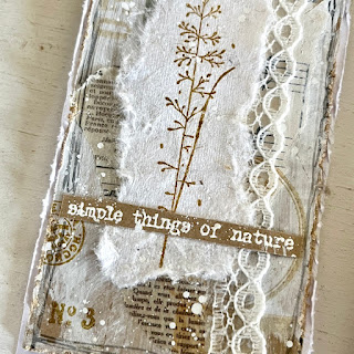
I love anything which captures light - the glass bottles again, but also the acetate and/or embossing powders in the various tags and artwork I've included.Let's detour into those artworks... Long time blog followers may remember that I used the name "butterfly" in the early days (I'm still "butterfly crafter" on Pinterest).I didn't realise as I was selecting them, but it turned out the main tags I chose to feature all have butterflies.There are two main pairs of tags (and another pair plus one). Making things in pairs and sets and series has become very much part of my creative mode. Even though the tag pairs are slightly separated here (one of each pair in the crate, the other dangling beneath), they still call to one another.
They are Tim Holtz Idea-ology butterflies... he's a massive influence in my creative journey. In fact, it was discovering his Distress Inks that started my whole visual art journey. These tags are made with Distress Inks, my very first crafting love (soon to be followed by Tim Holtz designs in Idea-ology, Sizzix and all the rest of the Distress mediums!).
The other huge influence has been my creative partnership with PaperArtsy. Very early in my journey, Leandra Franich got in touch to invite me to be on their Design Team, and many happy years of doing that then led to me to designing stamps for PaperArtsy. That started with words... quote collections, with each set geared around a theme - Trees & Flowers, Music & Silence, Friends & Friendship, Night & Day and so on. Words gathered from across the centuries and around the world, many of which I had been collecting in notebooks for years, which could now be available to me (and others) as rubber stamps to be added to art and craft creations of all kinds.
In the meantime, I had started to explore watercolours, both loose, free-flowing watercolours (like the one included here in the crate), and also much more precise and detailed botanicals.That botanical watercolour journey intersected with my PaperArtsy partnership to create the botanical sketch stamps you can see in action on a couple of the butterfly tags. (Violets from the Violet Edition and rosemary from the Rosemary Edition.)
Those botanical stamp sets include theatrical, historical and personal memorabilia too, so it all comes full circle back to theatre and words! And there are personal memorabilia here in the crate too, which brings me to the other main stories running throughout the display.
Why did I move to the Czech Republic? It's a question I'm often asked... the simplest answer is that it's my family heritage. My maternal grandparents were both from here. That cinefilm reel not only references my theatre/film connections, but came from my grandfather's big collection of films.
The postcard comes from a huge collection gathered by his cousin, Martha Pollack, on her worldwide travels with her sister Edith. My stamp designs include some of her school reports from Vienna in 1903 as ephemera - I really wanted to include one of those in the crate, but decided it was too fragile to be up on the wall, so the postcard is a substitute! Her side of the family fled to the US (where Martha became a renowned concert pianist), but my grandparents decided on the UK, so that is where I was born and brought up... luckily, since that's the home of Shakespeare!
But when I decided I had had enough of being constantly on the move (the whole of my working life has been peripatetic - even those apparently stable ten years with the RSC) and wanted to put down roots, both literal and metaphorical, the Czech countryside is where I chose to do that. (My mother had been spending half of each year over here for 20 years, so I was used to visiting, and there was a network of friends and support already in place, plus I am entitled to Czech citizenship because of my heritage, so I've got the passport!)
The rusted key emerged out of the attic as it was being converted into my new bedroom. No idea what it opens or winds - a clock, maybe? What is now my craft studio was originally a cow shed, so I'm not sure why there would have been a clock in the attic above it.I wanted to live a life here in the Czech Republic that was kinder both to the planet and to me. A bit less time spent jumping on jet planes and a bit more time spent walking in nature. (If you've seen my other Instagram account Bohemian Home, you'll know I've got plenty of that!)I knew I would love exploring the Bohemian countryside, but I didn't expect to become quite so busy in the garden. Just as the art journey was unexpected, so was gardening... but it's the other big story in my life and in the crate.
I always wanted to grow some of my own food, but it never occurred to me that I would be buying hundreds of flower seeds and bulbs each year too! The dried flower stems signify that new world of gardening opening up.
There are always plenty of them drying on the windowsill, waiting to be included in art works of all kinds...
And the eggs are there for the hundreds of birds I encourage to join me in the garden. They're eating me out of house and home, but I love having their company and their singing to brighten each day.The dried flowers also appear on the tags in the crate. It wasn't conscious at the time, but it turned out to not to be accidental which tags I chose. As I was photographing, I realised the tags I picked out not only have the dried flower stems from the garden on them, and the butterflies, and my own botanical stamps, but many also have words from my PaperArtsy quote collections (these two are snippets from quotes on the Nature Edition)... 
... and this quote from Gardens & Growth happens to reference the garden story. (And it also taps in to one of my most recent creative adventures, teaching in Fodder School - the floating quote technique is the one I taught for the Fodder Challenge!)Even the ones which have Tim Holtz Idea-ology stickers or metal quotes have unbelievably apt words for this project... I promise I didn't choose them for those "story" references - they were simply the tags I grabbed in the early stages, and it's only later that I found how completely perfect they were, even though they were made years ago. I love it when your unconscious mind is in charge!Everything in the crate seems to fit with everything else somehow. Of course, that's to do with the colour story, the limited palette - but it's the palette I return to again and again, and it's the palette of nature - that's why it's so prevalent. (My palette also shifts with the seasons as nature's does.) But it's also about how interconnected the strands of my life are, the Words and the Pictures (and the theatre, the nature, the garden, the poetry). Each aspect feeds, inspires and influences the others.Reading this back, it all sounds very intentional as a creative journey, but I promise each step of my life has been far more accidental than planned. But I will admit that there is a level of poetic manifestation or dreaming at work.The poetry fragments on the fabric in the crate reflect that. They come from my very latest designs for PaperArtsy. One is by William Shakespeare - Prospero's words from the end of The Tempest. (Not a favourite play of mine, but a favourite speech... I love that the thought about dreams is hovering in mid-air so weightlessly.) But the other two are from The Lake Isle of Innisfree by William Butler Yeats (see, I've even paired my Williams). It's a poem full of yearning to "come into the peace of wild things", as Wendell Berry puts it. Yes, I'm coming full circle back to words again as a moving force in my creative life.Instead of the usual quotes, I've added the whole Yeats poem at the end of the post, along with Swineherd by Eiléan Ní Chuilleanáin (a definite partner piece to the Yeats, at least in my mind).
I think you'll find in both of them the poetic inspiration behind both my move from the frenetic people-based work of the theatre to a more solitary existence in the art studio, and my geographical move to the middle of nowhere in the Czech countryside.
They are words which have quietly, from somewhere deep within, been shaping the journey of my life. (The text & voice coach in me wants to add that they are both best spoken out loud.)
Thank you for joining me for this journey through my journey. As I said, it sounds a lot more calm and controlled than it actually is. The lived experience is much more of a creative chaos... I'm really making it up as I go along.It's only on reflection that I can see the threads which connect across the years... much as the initial creative chaos of any project becomes more orderly and reflective in the final version. I ended up revealing far more of myself in my project than I originally intended (another accident), so thank you Shay and Fodder School, for encouraging me to take these moments of reflection and discovery with this month's amazing offering. And thank you to all of you for being there along the way.
Happy crafting, all!
Swineherd
When all this is over, said the swineherd,
I mean to retire, where
Nobody will have heard about my special skills
And conversation is mainly about the weather.
I intend to learn how to make coffee, as least as well
As the Portuguese lay-sister in the kitchen
And polish the brass fenders every day.
I want to lie awake at night
Listening to cream crawling to the top of the jug
And the water lying soft in the cistern.
I want to see an orchard where the trees grow in straight lines
And the yellow fox finds shelter between the navy-blue trunks,
Where it gets dark early in summer
And the apple-blossom is allowed to wither on the bough.
Eiléan Ní Chuilleanáin
The Lake Isle of Innisfree
I will arise and go now, and go to Innisfree,
And a small cabin build there, of clay and wattles made;
Nine bean-rows will I have there, a hive for the honey-bee,
And live alone in the bee-loud glade.
And I shall have some peace there, for peace comes dropping slow,
Dropping from the veils of the morning to where the cricket sings;
There midnight’s all a glimmer, and noon a purple glow,
And evening full of the linnet’s wings.
I will arise and go now, for always night and day
I hear lake water lapping with low sounds by the shore;
While I stand on the roadway, or on the pavements grey,
I hear it in the deep heart’s core.
William Butler Yeats